Scrolling Substack Notes one day in September, I came across a collection of 1944 London Underground posters illustrated by cartoonist Cyril Kenneth Bird. The charming, hand-drawn posters, designed to instruct tube-goers of proper etiquette, each feature a small but distinctive trait: a little red doodle, instantly recognizable as a simplified version of Edward Johnston’s iconic London Underground logo.
“Very few brands could/would get away with [this] kind of playfulness with the logo,”
replied when I made a comment about the logo doodles. So often companies, especially old ones, have a tendency to take their logos very, very seriously. But there are other exceptions. This exchange with Benneworth-Gray—and both of us being book designers—reminded me of one such exception I’ve been meaning to write about: a running Russian wolfhound and a publishing house unafraid to play with the mark that represents them.Alfred A. Knopf was founded in 1915 by, well, Alfred Knopf. He was twenty-two years old. “The staff,” according to a history of the company produced by the publisher, “consisted of a secretary, an office boy, and an editorial assistant named Blanche Wolf, who happened to be Knopf’s fiancée.”1
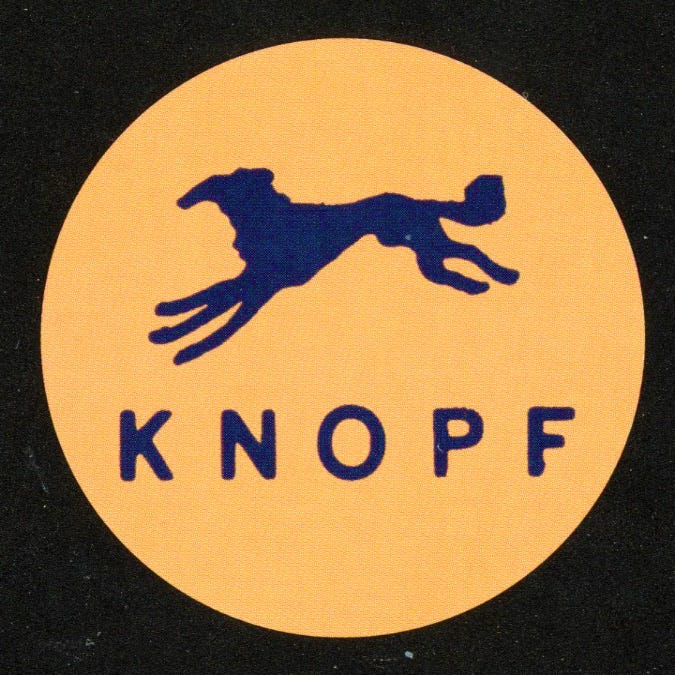
From the start, Knopf paid special attention to design, typography, and the general appearance of the books that bore his name. In 1922, the company trademarked the term Borzoi Books, along with the emblem of a Russian wolfhound.2 Near the logo on each book’s colophon page is the phrase “This is a Borzoi Book.”
From the very beginning we have frequently been asked the meaning of the word “Borzoi” and what it has to do with books. When I started in business the publisher I admired most was London's William Heinemann, and the sign of a Heinemann book was a windmill, drawn for him, I think, by William Nicholson. Since a windmill obviously had nothing to do with books, I saw no reason why we could not adopt the Borzoi as our mark.
—Alfred A. Knopf, 19483
If you pay any attention to who publishes the books you read, you may recognize this logo. But if you take a closer look at some of the Knopf titles on your shelves—particularly their spines—you may notice that, occasionally, the little Russian wolfhound looks a little bit different.
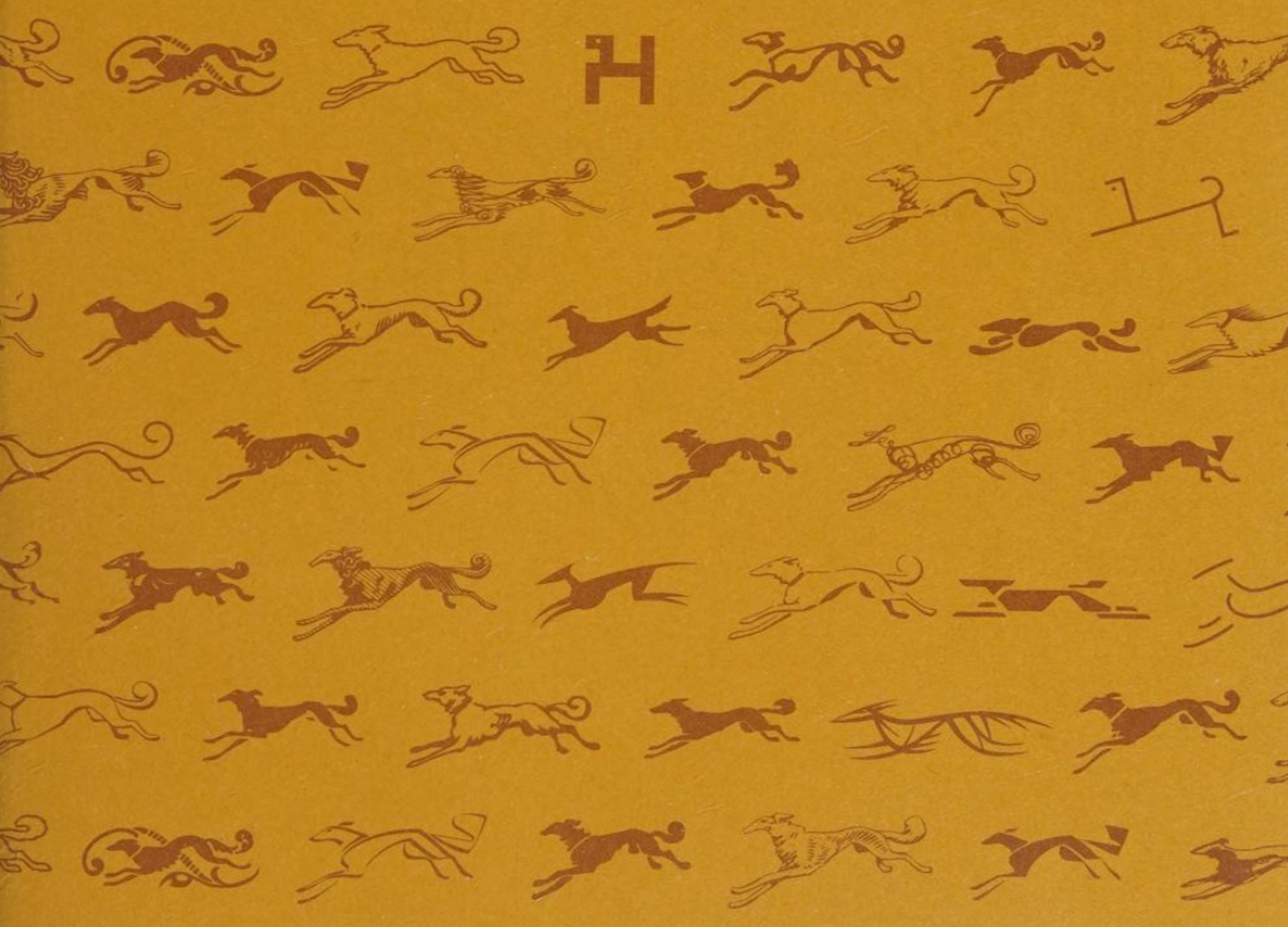
Even in the company’s early days, Knopf had a strong interest in working with graphic design luminaries such as W.A. Dwiggins, Frederic Goudy, and Paul Rand. Dwiggins, credited with coining the term “graphic designer”—falsely, it turns out— first started designing books for Knopf in 1926.4 Dwiggins did not design the original borzoi, but he set a precedent for designing new borzois.
Here’s Knopf in Portrait of a Publisher, 1915-1965: Reminiscences and Reflections by Alfred A. Knopf:
The coursing Borzoi has always been our trademark. The first dog was designed by an artist in Barron Collier’s organization whose name I have long since forgotten, if indeed I ever knew it. My father had this drawn—he was, at the time we started the business, associated with Collier. As time went on, different people tried their hands at different dogs—Joseph Sinel, Tom Cleland, Kahlil Gibran, Rudolph Ruzicka, Warren Chappell, for example. But Dwiggins drew endless ones—I don't know how many, perhaps fifty. Among my papers I find proof of two running from left to right. On this Dwig had noted: “These hounds are in retreat, heraldically. What scared them?” He had written years before, when he began making his own Borzoi:
About the enclosed drawings: I have had a lot of trouble getting your dog into title pages comfortably. I’d like it very much if Mr. Knopf would send these various versions—all of them—to Ladd and have him make plates of them. Then I would be equipped with a number of styles and “colors” to fit a variety of type feelings.
A neighbor next door has a good specimen of Borzoi, and I have checked my details—head, build, etc.—with that dog. I have used Ruzicka’s dog for position and action, so I think the drawings will hit pretty close to what Mr. K. would like. If I have got too far away from what a Dog Show judge would call a good style hound, Mr. K. will tell me and I can refit.
Sincerely,
William Addison Dwiggins
Dwiggins was not the first, nor the last to draw a new Borzoi. In 1945, legendary modernist designer Paul Rand was also asked to design a new logo when he came on board to design jackets for the prestigious publisher.5
“Always inclined to be contrary,” design historian Steven Heller writes, “Rand graphically reduced the sleek canine to a few simple straight lines at right angles, with a full stop for an eye. Prefiguring his later make overs of venerable corporate logos, this was a textbook example of Rand’s ability to redefine a visual problem and devise an alternative solution that pledged allegiance to the original form. Knopf was quite taken with the audacity of the designer in transforming the mark yet retaining its essential mnemonic quality.”
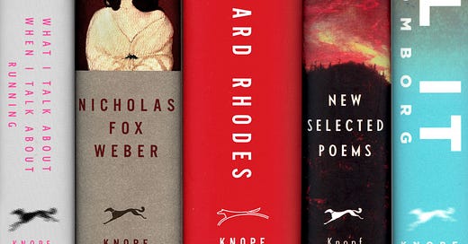
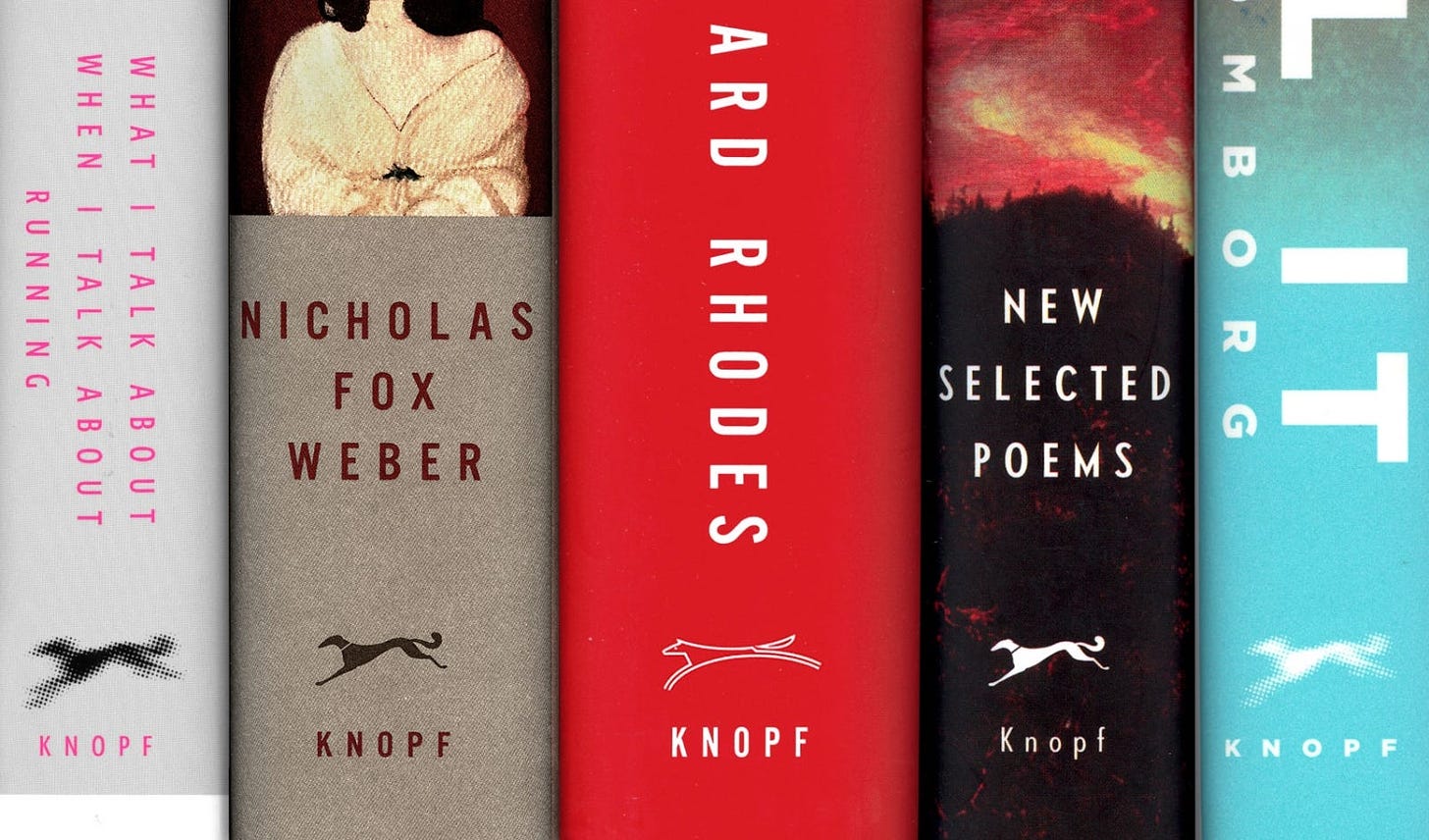
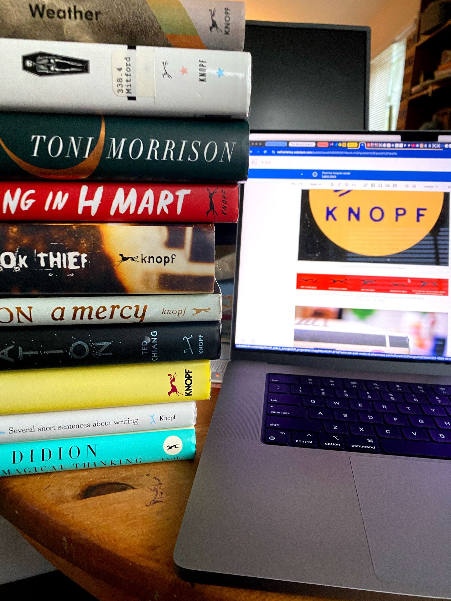
To this day, Knopf, still known for its book design,6 often publishes titles with new and different versions of the Borzoi. Before sitting down to write this newsletter, I pulled a sample of ten Knopf books off of my shelves. Of the ten, only three Borzois look the same—but the word “Knopf” is set in different type on each. On my copy of The Book Thief by Marcus Zusak, for example, “Knopf” appears in distressed, lowercase type that matches the title on the front cover. The spine of Exhalation by Ted Chiang, designed by Na Kim, features a modified Rand Borzoi made up of small, blue circles that matches the aesthetic of the rest of the jacket. Joan Didion’s The Year of Magical Thinking, designed by Carole Devine Carson, features an angular Borzoi that almost looks more like a deer than a dog.
Knopf Associate Art Director Chip Kidd is responsible for several different Borzois. His spine logo for Geek Love by Katherine Dunn was altered to have three front legs. “This [Borzoi],” Kidd writes in Chip Kidd: Book One: Work: 1986–2006, “got me into a little trouble … No one noticed it, until they did. When the book had been out for a month. And then I was called upstairs. Gulp.” It must not have been too much trouble, however, because Kidd remains at Knopf, where he has worked since 1986.

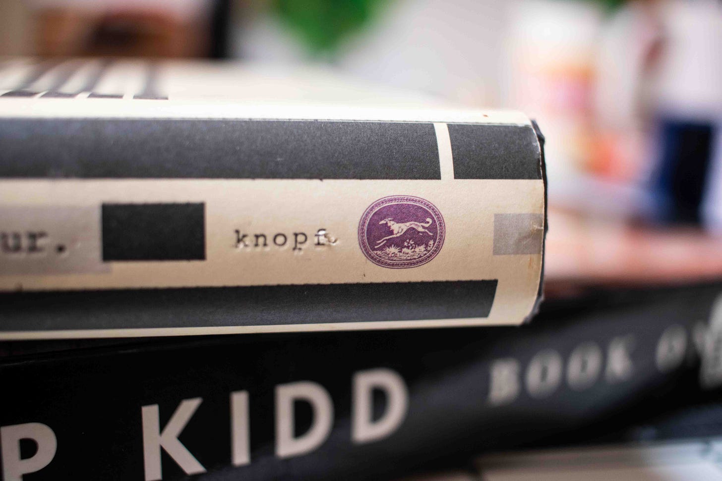
What I appreciate about this bevy of Borzois, in addition to their playfulness, is that it shows an innate understanding—even if Alfred and Blanche Knopf never thought about it in these terms—that a brand is more than its logo, and that playing with a logo can become part of a brand’s architecture. “A brand,” according to Marty Neumeier in The Brand Gap, “is a person’s gut feeling about a product, service or company.” You cannot control this gut feeling, but you can influence it, and Knopf has done so for more than a century7 by commissioning jackets by masters like Paul Rand, acquiring books by the likes of Toni Morrison, and indeed, allowing designers to “play” with their logo.
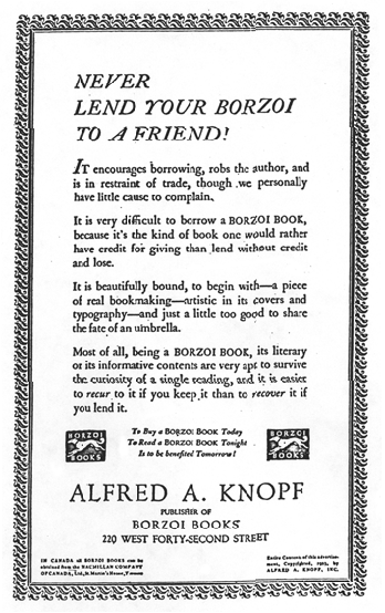
To that end, I thought I might leave you with “The Borzoi Credo,” penned by Alfred A. Knopf himself and published as an advertisement in The Atlantic Monthly in November, 1957.
I believe that a publisher’s imprint means something, and that if readers paid more attention to the publisher of the books they buy, their chances of being disappointed would be infinitely less.
I believe that good books should be well made, and I try to give every book I publish a format that is distinctive and attractive.
I believe that I have never published an unworthy book.
I believe that a publisher has a moral as well as a commercial obligation to his authors to try in every way to promote the sales of their books, to keep them in print, and to enhance his author’s prestige.
I believe that a review by an incompetent critic is a sin against the author, the book, the publisher, and the publication in which the review appears.
I believe that the basic need of the book business is not Madison Avenue ballyhoo, but more booksellers who love and understand books and who can communicate their enthusiasm to a waiting audience.
I believe that magazines, movies, television, and radio will never replace good books.8
Thanks for reading. I hope you enjoyed this nerdy publishing deep dive. Did you find any Borzois on your shelves? Do you have a favorite?
If you found this informative or interesting, consider buying me a coffee or upgrading your subscription. For $5 per month or $48 per year, paid subscribers receive access to a series of exclusive, themed chats with myself and a community of other book design lovers.
That’s all for this time. And remember—never lend your Borzoi to a friend!
Until next time,
—Nathaniel
Colophon
A Book Designer’s Notebook is a newsletter about books, design, and creative practice from the desk of Nathaniel Roy.
It uses the typefaces Merriweather, Futura, and whatever fonts Substack has chosen. Merriweather is a Google font designed to be a text face that is pleasant to read on screens. Futura is geometric sans-serif designed by Paul Renner in 1927. It is on the moon.
Nathaniel Roy is a book designer, collage maker, photo taker, self publisher, and a few other things in Ypsilanti, Michigan.
You can see his work and hire him here.
Alfred A. Knopf 1915–2015: A Century of Publishing. Alfred A. Knopf, 2015.
He founded the company with five thousand dollars advanced to him by his father—something like $100,000 today.
Clements, Amy. “The Legacies of Blanche Knopf.” University of Massachussets Press, 2016.
Despite being credited for choosing it, Blanche Knopf later thought the breed to be “cowardly, stupid, disloyal, and full of self-pity.”
More recent Knopf designers of note include Peter Mendelsund, Chip Kidd, John Gall, Barbara deWilde, and Carole Devine Carson.
Knopf has not been immune to the hungry publishing acquisitions monster, but it remains a big name in the business with strong associations.
I wonder what Alfred would make of Substack!








I'm learning such cool stuff from these.
I also vote that "bevy" be the official collective noun for "borzois"
“A bevy of borzois” is such a funny little statement that made me smile! Really enjoyed reading this little twist on history and design today.